Shufflizer is built on the Spotify Web API. This API does not provide ACID transaction integrity. If the user’s computer crashes in the middle of an upload, or if the user simply shuts the window in the middle of an upload, the uploaded playlist will be incomplete. If the user has two sessions going (ie. two separate windows on the same device or perhaps on different devices) and is making changes to playlists in each, it is possible that uploading could lose or duplicate songs.
When uploading to a new playlist these concerns are not a big deal, but Shufflizer’s default is to upload to the same playlist. Plus Shufflizer is meant for big playlists. The bigger the playlist the bigger the bummer if it gets ruined. (It is possible to enlist the help of Spotify technical support personnel to restore a playlist to a prior state, but obviously this is an undesirable last resort.)
Here are some things that Shufflizer could do to reduce risk
Playlist initial download:
After downloading a playlist for edit, confirm that the count of songs reported by Spotify agrees with the count of songs downloaded.
Same-playlist upload:
first upload as a new playlist, creating a temporary backup copy
then do the normal upload, rewriting the original playlist
now confirm that the count of songs reported by Spotify agrees with the count of songs uploaded
if all is well, delete the new playlist (the temporary backup copy)
With these measures in place, if something goes wrong the user will wind up with two versions of the playlist. Either the original playlist will be good or the backup version will be good, or even both could be good depending on the nature of the outage. It’s unlikely that both will be bad.
Why not just make Shufflizer always upload to a new playlist? Followers and clutter. Same-playlist upload retains a playlist’s followers. Same-playlist upload avoids the clutter of a great many similar playlists that would result from frequent use of Shufflizer.
ReactiveX Observables
I will begin working on these enhancements. I tagged this as a TypeScript and Angular blog entry because I think this will take me a bit deeper into ReactiveX techniques. Because I am working in Angular, all of the Spotify API REST interaction is accomplished with ReactiveX Observables.
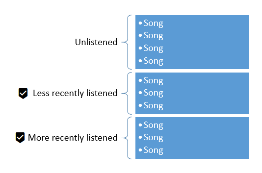
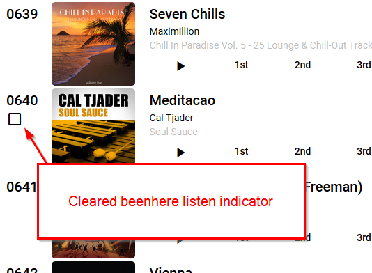
Shufflizer has new shuffle algorithm. This is the action that occurs when you click a rand button.
The songs are shuffled in up to three sections. If there are any unlistened songs they are shuffled and put first. Then if there are listened songs they are split into two sections, each shuffled separately. One is less-recently listened songs and the other is more-recently listened songs.
If beenhere listen indicators are turned off then all songs are shuffled as unlistened songs.
Quietly
Shufflizer does not communicate this sectioning to the user. The rand button “just works.”
With the old algorithm, if the user was paying attention to the end of the list the user’s expectation that songs should be moving around when clicking rand was not met. Recently listened songs were pinned in a certain order at the end.
Now with the new algorithm more shuffling occurs. Shufflizer still puts recently listened songs at the end, but is less pathological about it.
Shufflizer now sports Angular Material tabs along the bottom edge of the window. This provides a more conventional way to navigate between the app’s pages and also gives me a place to implement an options/features page when I get to working on that.
In addition, under the hood I put all the http calls to Spotify into their own service. This is what the Angular documentation’s HTTP page recommends. It helped me implement better error handling, and better positions the code to take advantage of Jasmine and Karma testing (which I learned how to do at the Angular Denver 2018 conference, and am looking forward to trying out in Shufflizer).
One other thing: immediately upon upload Shufflizer will start playing the playlist in Spotify, if you have a device active, running Spotify.
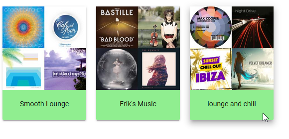
I have been using the Angular Material mat-menu for playlist selection. It’s Material Design’s version of a drop-down select, a classic original GUI prompt concept. There was a problem with long picklists on iPad, maybe due to the modification I did to make the picklist larger – for less scrolling. Also, I wanted a more modern and obvious UI. The user pretty much cannot do anything until picking a playlist. So let’s make picking the playlist a bigger deal up front.
I decided to get rid of the mat-menu and present each playlist as a clickable card. I knew this would be more work, and it was, but it was worth it.
Tabbing
Mat-menu supports the tab key. Once the drop-down appears, the tab key works to move through items. I want the same thing for my cards. So I added tabindex=0 to each card.
A tab key user likely will use the keyboard then to select – either the enter key or the space bar. With tabindex=0 the user can tab to a card, but then neither the enter key nor the space bar work for select. No key does. I solved this by binding to the keyup event, and making my function accept an optional parameter that gives me the keystroke. These lines of code are on each card:
Space bar really does send a single byte blank character through $event.key. The enter key, however, sends the string “Enter”. So my regular expression for space or enter is
/^( |Enter)$/
If the user triggers the function with any key other than space or enter, the function instantly returns, doing nothing.
Toggling
Just as with a classic drop-down select list, we want the cards to disappear when the user makes a selection, and of course reappear if the user wants to make a different selection. I spent a lot of time on this, trying many different user interface ideas. Here are a few things I learned along the way.
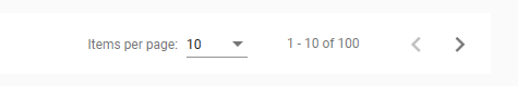
Avoid using *ngIf to toggle the existence of Angular Material’s paginator.
I advise this because if the user changes the items-per-page setting, it is lost when *ngIf removes the paginator from the DOM. This may not be a big deal at the time of removal, but be careful if the paginator might be subsequently restored.
Be sure hidden content is not tab selectable
I was using flex size zero to hide sections (eg. fxFlex=”0 1 0″ for the hidden state). I was horrified, however, when eventually I discovered that the user can still tab though, and trigger selection in, this hidden content. It’s much better to show/hide using [fxShow]. If you are unfamiliar with this syntax, it is from the nice flex-layout module that I am using.
Shufflizer has been updated. There are no new features.
This version of Shufflizer was created with Angular 6. Some obsolete sections of code have been removed. All layouts have been changed from old style html tables to Angular flex-layout (previously it was a mish-mash of these two approaches).
Known issue
Playlist selection does not work on Safari/iPad when the user has enough playlists that the dropdown picklist needs to scroll. This seems to me to be an Angular Material bug. I am considering a more luxury playlist selection interface, and am motivated to make it a priority since it would address this known issue.
One thing that was bugging me in my flex-layout performance solution was how I defined the global constants for my three layouts PHONE, TABLET, and HD. As always with constants, I’m just trying to make the code clearer to the reader. There is nothing more to this than PHONE is 1, TABLET is 2, and HD is 3.
We are not able to use the const declaration inside of class definitions.
const sizeNum = {PHONE:1,TABLET:2,HD:3}
Attempting this results in:
error TS1248: A class member cannot have the 'const' keyword.
We could define the constants outside of the class by putting the line of code just above the class, but this isn’t good encapsulation, and code fragments in the html template cannot see the constants. With the constants defined outside of the class, something like this is impossible:
<div *ngIf="activeSize()>sizeNum.PHONE">
Because of these issues, I resorted to a plain old hardcoded object, defined as usual inside of the class:
sizeNum: Object = {PHONE:1,TABLET:2,HD:3}
This doesn’t set up true constants. It is possible to programmatically change the sizeNum object later (eg. sizeNum[‘PHONE’]=5). Also, they are not global, and so I wound up having to pass the sizeNum object as a parameter to other components. Awkward.
There is a better way.
Angular dependancy injection
I am accustomed to using dependancy injection for full fledged classes, but it also can inject simpler objects. This works nicely for global constants. Set them up in app.module.ts:
By providing my own class with a selector that is more specific than what Angular Material is using, my style declarations come in as overrides. All other stylings remain in effect.
In web app development, animation is automation of the position and display characteristics of DOM elements. Angular provides its own programming interface for animations, insulating the developer from browser compatibility concerns. The developer defines styles for different states a DOM element can take on, and defines transitions for how to change from one state to another. Let’s first look at a non-animated example, and then animate it.
Hard cut
Say we have component with a variable named mood. Sometimes it holds the value “friendly” and sometimes it holds the value “mad.” In the component’s html template we display the value, but additionally we want a red background if mad. So far none of this requires Angular animation. We can use stock Angular to set the background color based on the mood value.
This creates what Rachel Nabors calls a hard cut. This term comes from video/film editing and means there is no transition from one scene to the next. The first scene ends and the next scene appears abruptly. In our case, the moment the value for mood changes, the background color instantly changes. The text does too, but for simplicity let’s just focus our work on the background color.
Crossfade
We can introduce Angular animation to create a transition instead of a hard cut. Say we want the colors to slowly transition for three seconds when the mood changes state, a rudimentary animation known in video/film editing as a crossfade.
Instead of directly setting the style for mad, we define an animation trigger. In the trigger we define the style for mad (red) and the style for friendly (green), and how to animate the transition (take a leisurely 3 seconds to change color instead of doing it instantly). I have named the animation trigger moodAni.
<p [@moodAni]=’mood’>{{mood}}</p>
mad
In Angular Typescript, in addition to the usual @Component selector and template, we define animations. The <=> means do the transition when going either way, from mad to friendly or from friendly to mad:
The term “crossfade” isn’t in the code. Any transition for an element that isn’t changing size or position is a crossfade. More generally, what the Angular animation module does is known as tweening. We define states or keyframes and then specify how long to take between each. This is quite a bit like CSS transitions. Indeed, you might be wondering how I managed to get Angular examples working directly inside this blog. I didn’t. They are pure CSS equivalents.
Nice corral you got there, Angular
If you haven’t made the plunge yet into Angular animations, you might be wondering if you’d be better off sticking with CSS transitions. It is possible. It’s what I was doing before I discovered Angular animations. I like the Angular way better. I don’t have to worry about browser differences, and the coding for animation is corralled into the component’s animations specification.
But some horses can get through that fence
Notice in the crossfade example above that if you click the button a second time quickly, the new animation immediately takes over. In Shufflizer I have a case where this isn’t desirable — the download progress spinner. For small playlists sometimes it would not fade smoothly in and out. When the download was done before the fade-in was done, the progress spinner would cut over to the fade-out animation. Nothing was technically wrong, but it was strange and unpolished. Here is how I solved it.
Angular provides an event that fires at the beginning and the end of an animation. I use this event to prevent shutting the progress spinner while the fade-in animation is still running.
So I like the animations “corral” but when we need to know the status of an animation, it’s not an animation we can just set into motion and forget about, then special coding for animations comes back into our TypeScript code.
For more information about Angular animation, see the Angular animations page. It’s where I learned most of what I know about Angular animations.
December 2025
Several years have passed and now the Angular Animations module is deprecated. Angular developers are to use CSS animations which are mature and well supported. I have refactored Shufflizer, removing its dependency on the Angular Animations module.
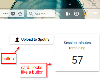
I choose raised for my upload to Spotify button because I wanted to convey its significance over the other buttons on the page. The upload button commits the user’s changes. Everything else is “just playing around” and easily discarded until the user clicks this button. It’s the “serious” button.
One morning, looking at my interface with a fresh mind, I realized this creates an inconsistent UI when also using mat-card. They both have the same raised style:
A user might think “the session minutes remaining button doesn’t do anything when I click it.” It’s not a button but it looks like the button that is sitting right next to it, the most serious button of all.
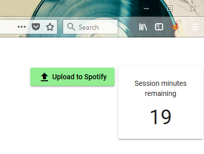
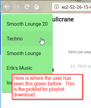
I could have changed the upload button to a flat button, so it would be consistent with all of the other buttons on the page, but I still wanted to set it apart somehow. So I decided to make it green. My picklist for downloading a playlist is also green. With this change, I am consistently using the color green to indicate where the user initiates playlist data transfer with Spotify, download and upload. I like the tie to Spotify’s branding color, which is a similar shade of green.
This still leaves the upload button and the card with the same raised style, but I am satisfied. When I make Shufflizer available to users, I will get some feedback about this.
